Wednesday, May 27, 2015
Reflection
Throughout this year in AP Art, it has been a wonderful, bumpy ride. At the beginning of the year I had previously had little to no instruction in the art room. I had no clue what a concentration was or how i was going to create 24 art pieces in 18 weeks. My lack of past instruction made everything more difficult for me to understand new techniques and ways to do things. I liked to stick with what I was comfortable with and nothing more. Me having no one to really tell me what to do or how to do it made listening to Mrs. Rossi that much harder as well. I'd never had an art teacher who watched me so closely or had very much interest in what I was doing. Despite us having extremely different views on most everything I did, I am extremely thankful to have learned so much from Mrs. Rossi and grown more in 18 weeks than I had in the 4 previous years in my art classes. I feel like I have evolved in many different ways thanks to my teacher and my classmates. I am no longer worried about trying new things, although I like what I like. I have a better understanding of how to create a good art piece through the media and composition which previously, I just winged it. I will always remember how I would think I was done with a piece and Rossi would yell at me saying, "Oh no, it needs a back ground," or "Go darker in values," or "Add more". All of these things are what teachers have never said to me before. It was nice to feel like someone was interested and when it was all done (despite me probably arguing with her) I loved it. I know now why she pushes everyone to do more, it adds on to all of our pieces and makes everything we work for worth it when it works out and looks so great. I will never forget the things my first "instructional" art teacher has taught me and everything my friends have done. This is a wonderful class to grow in and experience, I'm so thankful for everything everyone has done and taught me. I will miss my art family so much next year.


Tuesday, March 31, 2015
Concentration #3: Domestic violence
There are just some things that everyone agrees on. Any religion, any state, both political parties, everyone would agree that domestic violence is a HUGE no-no. If someone could look at these pictures without flinching, I would honesstly be concerened.
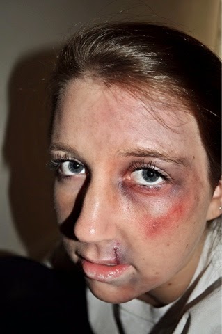
How I went about creating this masterpiece on Hannah Bush was I just used makeup. I used deep purples and reds to create the effect of fresh bruises and then greens and yellow.


I love all of these pictures so much, I wish I could just turn in the photos not the actual project. Hannah being beat up really scared me because its okay.

The challenges for this project was definitely finding the right lighting to talk the pictures on. I took like 200 photos to make sure I had good lighting and angles.

I really wish I couldv'e just left the pictures how they were before but I had to arrange them somehow so i decided a piece of work since it is basically what the house is made of. I then used certain phrases people are CURRENTLY using to hide up when the parents threaten and hurt their kids or when a significant other is in a violent relationship with you. I put the photos in a line down the wood with the quotes underneath.
Concentration #5
In this idea, I wanted to show dead skeletons of sea creatures. These are corals or something like them after they deteriorate and die. I chose to do this on scratch-board because i had never done it before and i thought it would look really cool with the skeletons on top like that.
I practiced on and extra sheet and after I "perfected" the skeleton, I was ready to begin with the real thing.

next, I got a new piece of scratch board and drew these little sea urchin things all over it. My idea to incorporate the mechanical portion of this is to have them ginding like gears. man made the things that kill these animals on the west coast; oil spills.

Next, I got impatient with how long everything was taking so I started just drawing out the outline of all of them. My biggest issue with this project was finding time to do it. I realized that scratch board can take a very long time if you do small details everywhere that take precision.

I have honestly never been so happy to see a project get completely done with. I can't believe how long it took. however, despite the amount of time it took, I am so happy with the end product.

Concentration #7
So, obviously, child hunger has always been a problem world wide. There's simply just not enough food and resources in some countries to feed all of the children that parents have and can't provide for.
First, I drew a little boy (assumingly from a third world country) that you could see his ribs to show starvation and dehydration. I drew an empty bowl sitting in front of him which could represent a number of things such as, water, food, no one to care for him, no shelter, etc. He is curled up in ball and that could be taken as him being embarrassed by his physical state or curling in pain from hunger or even cold and scared.

In this picture (below) I added the soil in and the water and wasn't very happy with it. It looked too much like the boy was sitting on the side of a river or something. At this point i thought everything needed more value and shadows.

I also added a light yellow wash in the sky that looked to me like the boy was in a desert or a barren place somewhere, which is where he would be anyway if he was starving.
A point I wanted to make with this piece is that food can be all around someone (or water) but can not be eaten or isn't in he right form. There is green grass everywhere around this little boy, yet there's nothing to eat. There is also water that looks drinkable, right underneath him, but he is dying from thirst.

The hardest part of this project was incorporating the mechanical part of everything. obviously bowls are man made and so are bricks so I tried with that but it wasn't really enough so I added more. I put black more mechanical -looking objects in the grass and then a circuit board in the soil that could be seen as a passageway for animals aka worms. My favorite part about all of this is either the boy, because I never do people or the water because I like the texture from the watercolor.
Concentration #6
Most people assume that when the 13th Amendment was passed that slavery ended. Sadly, this isn't completely true. There has always been a type of "servant" towards an upperclassmen, whether it be an actual slave, servant, maid, worker, cleaner, etc. Even to this day, there is basically the same thing as a slave. When someone needs to pay back someone and they aren't wealthy enough to pay it off with money, they can work it off. Most of the time it's the amount of money that wouldn't be able to be payed off in a lifetime. This is currently a problem in our world so I wanted to do something simple yet effective to portray this terrible situation.

So I took pictures of my peers', teacher's and family's hands cupped like they are waiting to be giving something, begging almost. However, in the top hands it could just be so filled with money or gold or whatever it may be. Then, I printed them out (each one in black and white and color) and placed them on the canvas to see what I liked.

So I ended up choosing the black and white ones because I didn't really want skin color to be a factor whatsoever. I placed them so I could do a waterfall type thing with money trickling down to the bottom hand which would be the least wealthy.

Next, I added the pennies in the trickling waterfall type thing I had planned. I had the shinier pennies at the top to just emphasize the idea of wealthiest and cleanliness of people. I really loved the pennies on it but I felt like it needed something in the background. I really liked the white space though and I didn't want anything to take away from the hands.

So to keep the white space and still add something more to it but not overpower it. I added slavery newspaper articles to the background and glued them on and then painted over them with hite paint to take away from the straight up black and white.
Concentration #8: Bullying
Bullying is a world spread problem just as much as racism or anything else that extreme. I think it shouldn't be taken lightly. I wanted it to be portrayed as something that is overcoming someone. completely taking over, in a depression kind-of state. To where that's all a person thinks about and is consumed by. I took photos of Ciara Delgado crouching in a corner for my reference pictures for this project.

I chose to use charcoal so I could get value underneath the words that I soon planned to put on top of this picture. I was definitely scared and uneasy of what I was going to do with the background. I didn't want it to take away at all from the person (Ciara) or the words which was the whole point.

I put water color as a wall and floor because somehow I always end up putting water color in my projects normally. I loved the shadows underneath and the way it seemed that she was in a big shadow herself. As shadows for the clothes and body and hair I used words that are hurtful or used in bullying situations. There wasn't a limit to what I used as words as this is the point of the project and what it stands for.

The most difficult part about this project was that I drew a person. I hate drawing people and I can't believe I went through with it. All in all, I am happy with the way this turned out. I loved the words and the way they looked like shadows from further away.
Subscribe to:
Posts (Atom)