Monday, January 12, 2015

#7 Landscape

For my landscape I went back and forth between countless pictures trying to figure out something I could do that meant something to me and wouldn't be boring. I wanted to try and do water since I never have with oils but I didn't want it to be a typical ocean beach picture. I chose to do a picture from Russia that my friend took when he was traveling. It was out of a train going through the heart of Russia on his trip last summer. I knew it would be difficult because every thing up close was so blurry because the train was moving so I had to improvise a bit with the grass and road. 
First I just sketched out where everything would go and did a wash on the road and started the water. I didn't want to do a wash where the water went because some areas were so light which I regretted afterwards but whatever. Now I  know I should always add one. 

Next I finished the water and added a highlight on the center-left area as that is where the sun was hitting in the picture. I put some colors down on the mountains to start. It was hard because in the picture the sun was coming from behind so the mountains got darker as you came closer. I did it on a sketch and it looked totally wrong so I just did the mountains darker as they went back and ignored the picture. 


My least favorite thing about this project was definitely the green grass. It was so blurry because the train moving. I didn't really know how to tackle it. I tried to add as much value in the green grass as I could but didn't really know where to start or how to make it look real because the picture was so blurry. I liked this project okay over all but the only thing I was really happy with was the water. 


# 6 mechanical

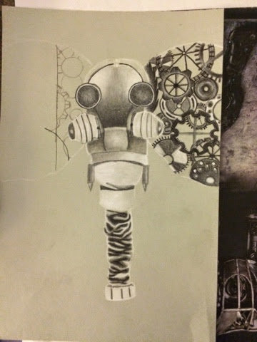
When we got told we were doing a mechanical project I couldn't be more nervous. I had never done or even thought of doing anything steampunk-like. The topic was making something organic into mechanical. So I came up with the idea to change an animal to something mechanical or man made that barely resembles the original animal. I went through tons of ideas of animals including birds, butterflies, deer and others. I ended up going with an elephant because of the space in its ears I could use for whatever I wanted and it resembled a gas mask from previous wars pretty well and I really liked the idea. 


I started by doing the "body" so everything except the ears. Doing the trunk was one of my favorite parts of this project because of the way it ended up. I added bullets to the face to act as tusks. 


I began by buy putting gears from the inside of a clock or something like that into the ears to fill the space. I tried to vary size and color as much as I could so it wouldn't look too repetitive. I chose charcoal for this project because I had never used it before and wanted to give it a shot. I also decided to try sketching new because I was creating something that I never had done before either. I'm glad I did because it's one of my favorite mediums now. 


I decided to crop the picture where the elephant head wasn't in the middle of the paper. 


I was done with the elephant and it was cropped but it didn't look close to done. I liked the value you could see in all of the white places and im really happy with the color of paper I chose. 


Since it needed more, I just decided to add more elephants and nothing new. I added three at the bottom scattered around. I really was happy with the final for so many reasons including the fact I did four objects (not an odd number) and it still turned out really cool. This is my favorite project I've ever done and I really hope to continue using the mechanical theme. 


#9 Animal

 When we got told we had to do an animal project I new immediately what I wanted to do. I have a deer mounted in my living room and I've been wanting to do a project with it. I didn't really know what medium to do because of the fur being so short but I wanted it to be different than most animal portraits so I was thinking water color. I sketched it out in pencil first but I didn't take a picture of that. After it was sketched I added light colors where the darkest spots had to go so I would know where to add the most color or shading at the end. 

So this picture is when I finished the water color part of it. The antlers were difficult to do because of all the shading and different colors in such a small area with water color. I liked the way the whole piece itself looked though. For the background I just did a green wash type of pattern to stand for grass or a field or wherever a deer might be naturally, not on my wall. The picture below is the project done once I added prisma pencils to add texture to the fur in the thicker places and then details to the face and antlers. I really enjoyed doing this project but I do wish I could be better at prisma pencils because I don't really like where I used them for the fur. Overall, I like the way it turned out. My favorite part is the bottom right where the dark fur is but I did most of the fur strokes with a paint brush there so I think that could be why I like the way they look better. 


Concentration #1

This is my first choice project and I got to go ahead and start on my concentration. My concentration is the goal to portray real world problems in my art through the use of mechanical and organic organisms & objects. The big problem I chose for this specific one, is smoking. Over 50% of my family smokes or uses tabacoo and I hate it so I thought I would do a piece on it. Too many people are getting sick because of this God awful substance. It, like so many other hatful things, is man made. This is the idea behind things being mechanical in my work. If things are man made, they can't be completely harmless no matter what people tell you because they are UNATURAL. 

To start off my project I drew a set of lungs to create one (left) to be a healthy, natural lung, untouched by any man made substance. It has a tree in it to stand for trees that give us oxygen to breathe and without them we wouldn't be. So I could spin some deforestation off of this too! Then, another (right) to be a smokers lung who has given in to so many temptations for whatever reason. 

 
I began filling in empty spaces in the lungs with gears and what not in the right lung with black and white charcoal pencil and blended it. Then on the "healthy" lung I used prisma pencils to do the bark for the tree inside and then watercolor for the leaves and rest of the lung. 


It looked very good to me, but not complete. It needed something more. I thought about doing a full spine all the way down the back but decided against it because I didn't think it would look that different or take up enough space. 


So I decided to start another part of the human anatomy- the ribs. I began by making sure they matched up across from eachother and then started filling them in. I used solid black for the "dead" lung because it's so dark and made the lung pop and I think it's just what it needed. Then i used brown to work on the other one to make it still dark but a little bit more suttle. 


To finish off the project, I added water color spouting out the top and dripping down the bottom to allow movement since the piece was previously so restricted. I'm extremely satisfied with how it turned out. 


I was very happy with my finished project and I think it turned out very well. It was extremely different than what I had anticipated it being like when it was done but I liked it more than my original idea. I hope that the message behind it is seen by everyone who looks at it. 

Thursday, January 8, 2015

#11 Bow

When I first found out that we had to do prisma color now drawings, I cried a little. I never have used prisma colored pencils before this class and the one time I did use them I didn't like the end result at all. 

When I started the bow I was so frustrated as I could not get it to blend right and look like the bow was curving or had highlights or anything. I put it away for a week and didn't even look at it. Then I took a different approach after watching a couple you tube videos and watching My class mates work on theirs. I layed down the white first and went over it with my lightest color next and progressively got darker. Only to add white again at the end. I had to force myself to be patient with it because of all the layering that it requires. 

When I started to get the hang of it, I really couldn't wait to finish it. I chose to only do one bow so I could make it really big and add a lot of detail to it. I occurs the blue and purple for my colors because it wasn't on the original picture and I didn't think anyone else would do it. I liked the way it was looking after finishing about half of it but knew it would need something more than just the bow. 


So, I added a ribbon. I wanted it to look like this was directly on top of a box so I didn't add perspective or anything to the ribbon. Only highlights and shadows. 


This is the picture I put on the website for the prisma colored pencil contest and I really like how it photographed. I like the background a lot and I think the bow itself is pretty good. I'm very happy with how this turned out and I'm proud to say I don't completely dislike prisma colors now even though I didn't like how long it took and how many layers were required. 


#5 self portrait

For my self portrait, I felt like doing something more abstract. People are so self conscious now a days that I feel like not many people are confident enough with themselves or their artistic abilities  to do a detailed self portrait. I chose to do more of a pop theme with blocks of color rather than lines with the water color. I did this to represent how the little things don't matter as much as the whole piece. I chose this photo of myself to do because In it I was fixing my hair and stressing out over something small which is how most of my life goes so I figured it would be good for a self portrait. To get all aspects of myself portrayed as possible. 

The wood was my favorite part to do on this project because of how it pops out (like Pop art kind of) and it was fun to do. I chose water color for this project because I didn't want it to look really like me even though it's a self portrait or anything to look realistic. I used pen a little bit on my dress to make it stand out more from the other Brown and neutral colors. I did all brown, black, and mustard colors for my "inner" self portrait. I'm a laid back person generally and I enjoy everything to blend in and stay calm. 


I really liked how the pen turned out on my dress because the dress in the first place was stripped but I didn't want it to be exact so I did a gray wash and then added value with the pen in lines on the edges and where the darkest areas were. I also put pen in the hair as well to create a textured effect so it didn't look flat. The water color couldn't generate the same look as the pen unless I used straight black paint and even then the lines weren't as prominent. 

The hand in my hair was a pain to paint because my fingers were in my hair and made them look like little stubs which was very irritating. So that's my least favorite part and something I probably need to work on. 

I did like how this project turned out but if I have more time in the future or came back to it I would add more to the background maybe and try and fix my hand. But that will take lots of practice. All in all, I think I portrayed my physical appearance as I wanted as well as my emotional and interior self though the colors I chose and expression on my face. 

Tuesday, October 28, 2014

interior

 For my Interior space project, I really struggled finding a picture of something real that wasn't simple like the inside of a box or room. I wanted something different. I was on the idea of doing something with the inside of an animal but I didn't want it to be too gory to where people didn't want to look at it. My friend Sammy is a really big fisherman and he took this for me to use. The inside of a fish's mouth seemed interesting to me because of all the different parts inside that humans don't have. I decided to use oils because they blend so well but I was a little unsure of using them because I have such little experience with them.
The canvas I'm using is 16 x 20 so the fish is taking a lot longer to complete than I had anticipated. The pinks and whites in the bottom left hand corner is my favorite part right now and probably will be at the end of it all. I chose to do it off center to the bottom left to be able to create reflections in the eyes and to get the top of the fish's head too. I'm using the warm, fall colors that make the fish look more realistic and like it did just get reeled in from a lake. I enjoy doing this project but all the layers are very tedious and it is starting to make me nervous at how long its taking. 


In this progress picture I have added more of the space in the mouth. The "rib cages" in the mouth are very hard for me to be happy with because they aren't the same in the picture on both sides and that drives me crazy.


 In this next Picture I have taken a break from the inside of the mouth and started working on the background. The water I did to have some contrast with the fish itself because in the picture it was almost the same and I didn't like that.
I used a palette brush for the Lilly pads because I feel like it gives them a blurred look and that's exactly how i wanted it, focused on the fish! I also added some grass because the shore was right there.This is an up close picture of the fish's head. I know its not realistic but i really am happy I went with pinks and purples for the outside of the fish. There were so many bland colors like browns and dark greens and blues, I really wanted to spice it up.


This is the finished product! I really liked the way it turned out, some parts more than others. I liked the Lilly pads, the eyes and the left bottom corner of the entire canvas. I do not think my "ribcage" turned out the way i wanted it to so i might just work on it more later on this year outside of class.